Graphing
Graphs are the window onto your monitored systems. Most of the times that you visit Datadog, you look at dashboards made up of graphs. Other times you see email notifications that include a graph of some fluctuation in the system. And yet other times you see graphs in your Slack, HipChat, and other chat clients documenting the changes in metrics over the course of time. Graphs are at the heart of monitoring and observability, so it is essential to understand how to define great graphs.The Graphing Editor
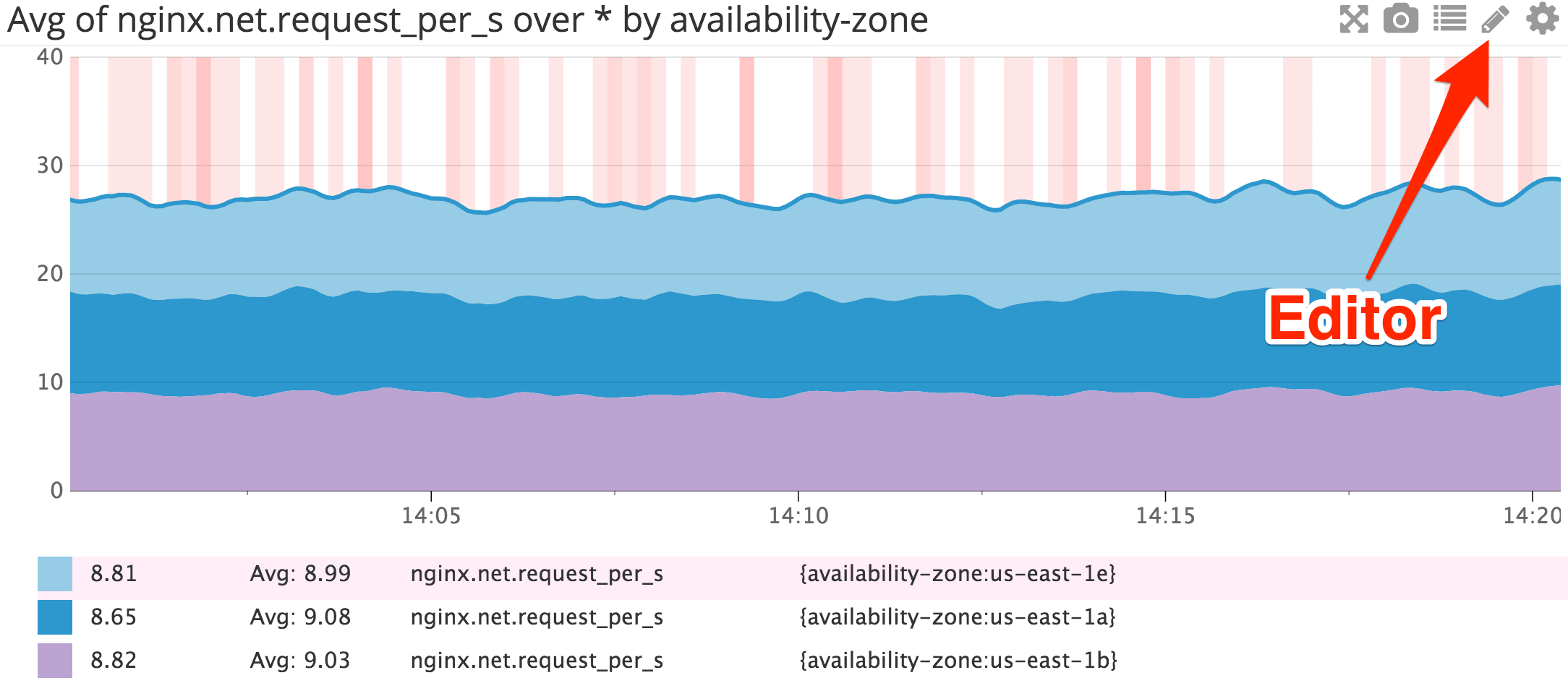
There are two ways to interact with the Graphing Editor: using the GUI (the default method) and writing JSON (the more complete method). This page covers using the GUI. To learn more about using JSON, visit the JSON Graphing Primer PageOn each graph there is a pencil icon that opens the graph editor.
- Share: Allows you to embed the graph on any external web page (Note: The share tab is only available on Timeboards.).
- JSON: The more flexible editor, but it requires knowledge of the graph definition language to make use of it.
- Edit: Default tab that allows you to use a GUI to select the graphing options.
Editing graphs
When you first open the graphing editor window, you are on the Edit tab. Here you can use the UI to choose most settings to tweak your graphs. Here is an example of what you might see. This example comes from the first graph in the standard Postgres Integration dashboard: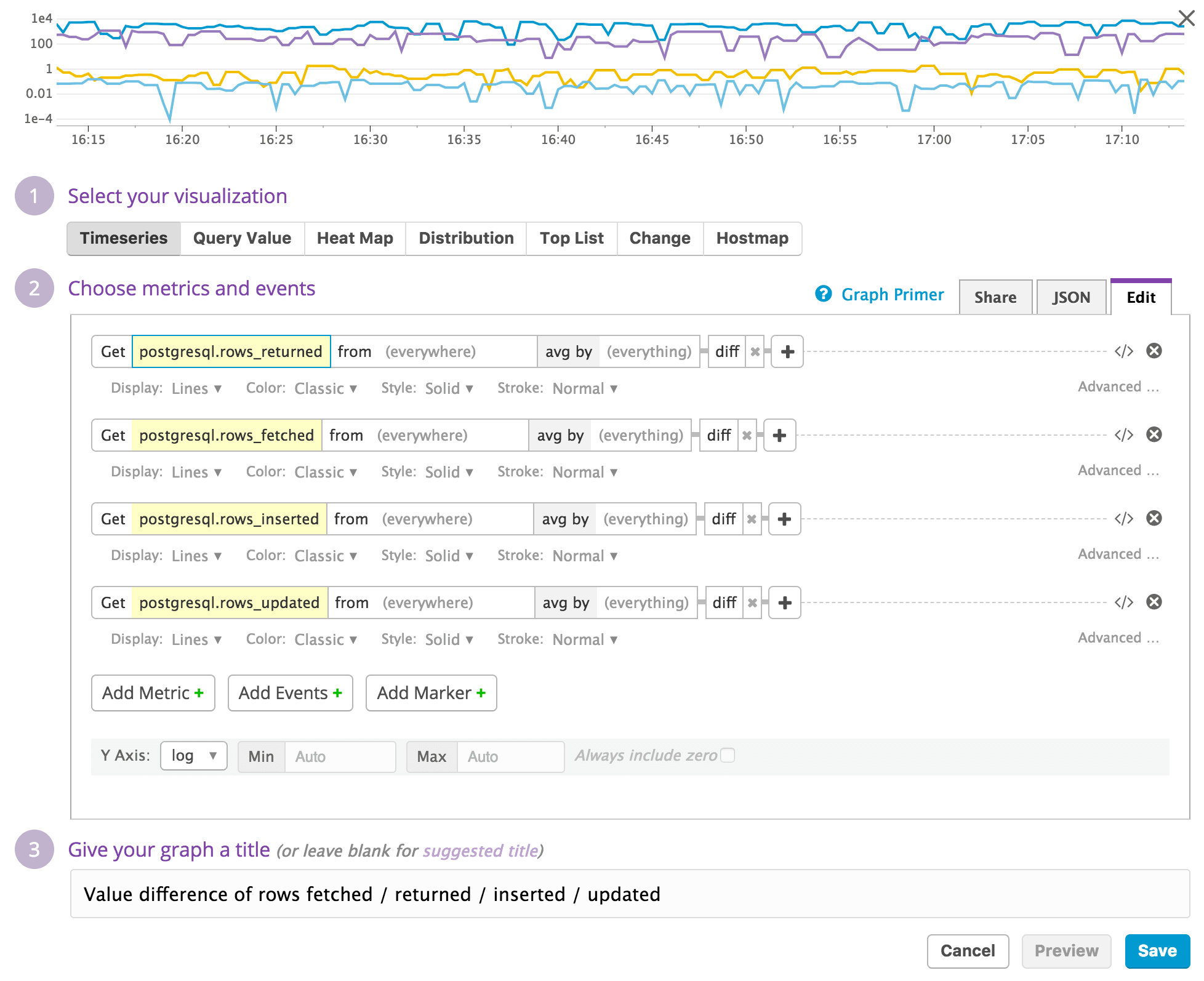
- Choose the metric
- Select the visualization
- Filter
- Aggregate and Rollup
- Apply additional functions
- Title the graph
Choose the Metric to graph
When you create a graph, you probably have a metric in mind that you want to show. You can select that in the first dropdown in the Choose metrics and events section. If you aren’t sure exactly which metric to use, you might want to start with the Metrics Explorer or a Notebook. You can also look in the Metrics Summary.The Metrics Explorer allows you to play around with different graph settings in a more ad-hoc way. The Metrics Summary allows to learn more about the type of metric as well as setting the default unit for a metric.
Select your visualization
Once you have a metric in mind to display in your graph, select your visualization.Find the list of all visualizations here
Filter and Aggregate to show what you need
Filter
Now that you have the metric and a visualization in place, you can filter down the hosts to be graphed. To the right of the metric is a dropdown which by default says (everywhere). Click this and choose the tag(s) you want to filter by. To learn more about tags, refer to the Guide to Tagging.Aggregation Method
Next to the filter dropdown is the aggregation method. This defaults to avg by but can be changed to max by, min by, or sum by. In most cases, the metric has many values for each time interval, coming from many hosts or instances.The aggregation method chosen determines how the metrics is aggregated into a single line. So if you are graphing a metric that is from 100 hosts, sum by adds up all of those values and display the sum.
Aggregation Groups
After the aggregation method you can determine what constitutes a line or grouping in a graph. If you choose host, then you have a line (in the case of line graphs) for every host. If you choose role, then there is a line for every role. Then that line is made up of metrics from all the hosts in that role, aggregated using the method you chose above.Rollup to aggregate over time
Regardless of the options chosen above, there is always some aggregation of data due to the physical size constraints of the window holding the graph. If a metric is updated every second and you are looking at 4 hours of data, you need 14,400 points to display everything. Each graph we display has about 300 points shown at any given time.In the example above, each point displayed on the screen represents 48 data points. In practice, metrics are collected by the agent every 15-20 seconds. So one day’s worth of data is 4,320 data points. You might consider a rollup function that looks at 5 or 10 minutes worth of data if you would like to have more control over the display of your data for a graph that shows 1 day.
To use the rollup function, click the plus sign to the right of the aggregation group and choose rollup from the dropdown. Now choose how you want to aggregate the data and the interval in seconds.
To create a single line that represents the total available disk space on average across all machines rolled up in 60 seconds buckets, you would use a query like this:

"q": "avg:system.disk.free{*}.rollup(avg, 60)"
Apply more advanced functions
Depending on your analysis needs, you may choose to apply other mathematical functions to the query. Examples include rates and derivatives, smoothing, and more. For a list of available functions click herePerform metric arithmetic
The Datadog UI supports the ability to graph your metrics with various arithmetic options. You can utilize any of:+, -, /, *
to modify the values that are displayed on your graphs. This syntax
allows for both integer values as well as arithmetic using multiple
metrics.Metric Arithmetic Using an Integer
You can modify how a metric value is displayed on a graph by performing an arithmetic operation on the metric. For example, if you would like to visualize the double of a specific metric, saysystem.load.5:
Graph these queries as box. In this case: a * 2.
Arithmetic between two Metrics
If you would like to visualize the percentage ofjvm.heap_memory used, you can perform the following arithmetic across two metrics already being reported to your Datadog application:jvm.heap_memory / jvm.heap_memory_maxThis can be done in the same manner as above, utilizing the “advanced…” option in the Graph Editor. From there, you can select
add a metric to this expression.Once you have added all of the metrics you would like to visualize, notice they are each assigned a letter: the first metric is represented by a, the second metric is represented b, and so on. Then in the
Graph these queries as box, you can enter the arithmetic you would like, in this case: ( a / b )
Set Y-axis scale
By default, the Y-axis for your graph is set to linear with the minimum and maximum automatically set based on the values in the data and including zero. To make changes to the Y-axis, click the button Show Y-Axis Controls. Now you can change the scale from linear to log, pow, or sqrt. Next you can choose the minimum or maximum, and select whether zero should always be shown or not.Overlay events for additional context
You can repeat all the steps above to add additional metrics to your graph to add context. You can also add events from related system to add even more context. So an example would be to add github commits, Jenkins deploys, or Docker creation events.Just click the Overlay Events button and enter a query to find and display your events. To show anything from a source such as Github, use
sources:github. For all the events with the tag role:web, use tag:role:web.
Thanks for sharing.
ReplyDeleteDevOps Online Training
awesome post thanks for sharing the post.
ReplyDeleteFull Stack Training in Chennai | Certification | Online Training Course | Full Stack Training in Bangalore | Certification | Online Training Course | Full Stack Training in Hyderabad | Certification | Online Training Course | Full Stack Training in Pune | Certification | Online Training Course | Full Stack Training | Certification | Full Stack Online Training Course
best post thanks for sharing the articles.
ReplyDeleteFull Stack Training in Chennai | Certification | Online Training Course | Full Stack Training in Bangalore | Certification | Online Training Course | Full Stack Training in Hyderabad | Certification | Online Training Course | Full Stack Training in Pune | Certification | Online Training Course | Full Stack Training | Certification | Full Stack Online Training Course
Thank you for sharing valuable information.This article is very useful for me valuable info about mysql
ReplyDeleteGood Post! Thank you so much for sharing this pretty post
DevOps Training in Chennai
DevOps Online Training in Chennai
DevOps Training in Bangalore
DevOps Training in Hyderabad
DevOps Training in Coimbatore
DevOps Training
DevOps Online Training